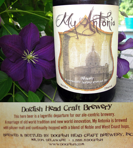
My Antonia – Dogfish Brewery
The nice thing about the big 750 ml bottles is that you get the benefit of a larger label. This label caught my eye in the shelves because it really has a touch of class. I really like the juxtapositions on this label. The plaque has an elegant shape but is made from rough textured paper. There is a blend of ancient architecture with more modern structures in the background. The typeface dogfish uses always has a bit of playfulness to it and the words “a continually hopped…“ lets the you know that this beer uses the method of hopping that Dogfish is so famous for. The label gives us a nice description of the beer we are about to enjoy. The visuals on the label talk less about the beer, but instead speak to the history or story that the brewery has embraced for inspiration. You can find out more about the story of the beer on Dogfish’s site – it explains that the beer was named after a book by Willa Cather called “My Antonia” and you can learn bit more about the brewing collaboration that was done for this beer. It is a great design because even before you hear or see anything about this beer, from the brewery or a commercial, a story is already revealing itself and you get a sense of what this brew is all about.
