Brooklyn Lager – Brooklyn Brewery
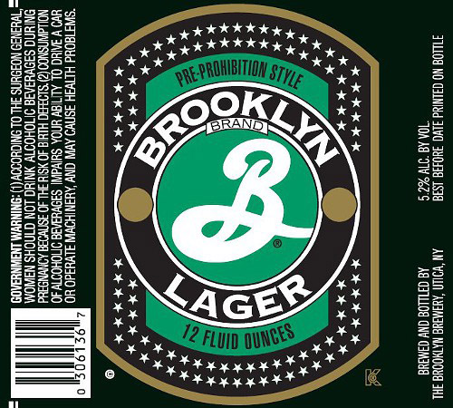
A big B and star studded. The famous Milton Glaser designed this label, or at least his company designed it. You may know some of his other work like the “I [heart] NY” campaign and the Bob Dylan poster that was done for Columbia Records. Few labels stand out on the shelves like Brooklyn Brewery’s Big B. It has a nice simple design with a few good classic elements like the stars and the large script B. The Brooklyn labels are very graphic in nature. No photographs or detailed illustrations, just good strong color palettes and bold graphics. The phrase “Pre-Prohibition Style” sits on top of the Brooklyn crest and supports the vintage approach to the label design. Think of all the pre-prohibition beers and their label designs-Piels, Pabst, Bud- most of them have no photographs, just unique graphic elements that proudly display the breweries name. The brewery is the focus, not the particular beer, which these days is very often the case. Grab that “B”, and you know your getting a good beer – that’s what good package design is all about isn’t it?

