Prima Pils – Victory Brewing Company
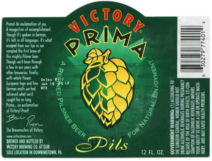
The vibrant green of this label works beautifully with the bold yellow hop graphic. “Victory for your Taste!” appears on the neck label (not shown here) and the small print on the side of this label gives you a bit of insight as to what the brewers intentions where. It explains that “Prima” is an exclamation of joy in German. They proudly explain that this beer was a journey for them and that through their experiences in brewing they where finally able to arrive at the Pilsner they were looking for. The brewmasters signatures add to this personal story.
Fun typography with the sharp edges of the “PRIMA” font balance with the scripty “Pils” type, which if you look closely, has a black condensed “PILS” font sitting just behind it. Mixing typefaces can often spell disaster for a design unless it is created by an experienced designer. This design has a lot of nice little details, like the barley that creates a line pattern behind the hop or the impactful color pallet that was chosen. Overall I’d say this label is a Victory for design as well as taste.
