Somersault Summer Seasonal – New Belgium

Beer Label Reviews on June 20th, 2012 No Comments

Somersault Summer Seasonal

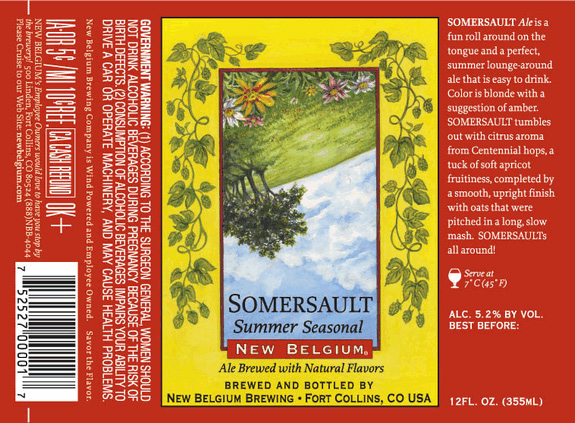
It’s summer time, and the livin’s easy. Since our thermometers have shot up I thought it would be appropriate to review a summer ale label. New Belgium is the third largest craft brewer in the U.S. but you never really see it on the East Coast. Kudos to the New Belgium Brewery for this simple yet effective label concept. The label has a beautiful summer time illustration that shows the world from a different perspective. The description on the label is informative and the label design is inviting.  Serving temperature is a nice touch and makes me think that this brewery really cares about the quality of your beer drinking experience. Somersault Summer Seasonal looks like a nice lawn mower beer, I look forward to trying one someday.
Tags: ,

My Antonia – Dogfish Brewery

Beer Label Reviews on June 11th, 2012 No Comments

My Antonia

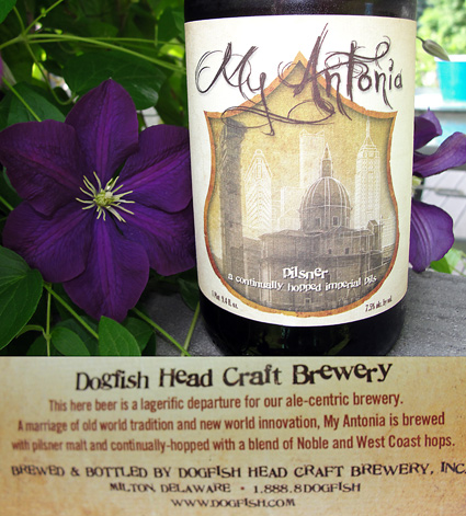
The nice thing about the big 750 ml bottles is that you get the benefit of a larger label. This label caught my eye in the shelves because it really has a touch of class. I really like the juxtapositions on this label. The plaque has an elegant shape but is made from rough textured paper. There is a blend of ancient architecture with more modern structures in the background. The typeface dogfish uses always has a bit of playfulness to it and the words “a continually hopped…“ lets the you know that this beer uses the method of hopping that Dogfish is so famous for. The label gives us a nice description of the beer we are about to enjoy. The visuals on the label talk less about the beer, but instead speak to the history or story that the brewery has embraced for inspiration. You can find out more about the story of the beer on Dogfish’s site – it explains that the beer was named after a book by Willa Cather called “My Antonia” and you can learn bit more about the brewing collaboration that was done for this beer. It is a great design because even before you hear or see anything about this beer, from the brewery or a commercial, a story is already revealing itself and you get a sense of what this brew is all about.

Tags: ,

Xingu Surprise

Ben's Journal, Drinking on June 7th, 2012 1 Comment

After you’ve combed through all your local liquor stores you start to get a pretty good idea of what the beer selection is like in your area. That’s why when I took my wife out to dinner to celebrate our anniversary I was pleasantly surprised to find a couple of beers on the list that I have not seen available anywhere else. The place was Costa Del Sol, a Spanish-Mediterranean restaurant in Hartford Connecticut.

When we sat at the bar before our meal there were two friendly patrons that chimed in when I inquired about the beer selection. One recommended Estrella Damm on tap. He had what looked like a nice light lager in his glass. The other fellow shared that he was drinking a dark beer from Brazil. I took his recommendation and the bartender went to his fridge to find the bottle of brew. To be honest when he first started heading to the cooler I was a little nervous that I had chosen poorly. Beer on tap is usually the way to go and having never been to this establishment before I had no idea how well they cared for their bottle selection. Sometimes when a bartender goes to the fridge you can see the layer of dust on the bottle and no matter how good the original product might have been, you are about to get a glass of old skunky funky beer. Well, that was not the case.

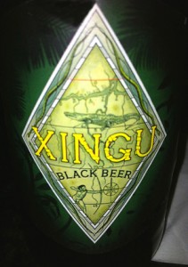
xingu label

The bartender revealed a bottle of Xingu black beer. It came in a beautiful bottle with a unique, well-designed label. The beer was a delicious, malty, fresh tasting beer with a rich mouth feel full of character. Between the beautiful label and delectable taste I immediately embedded this beer into my mental archive as a winner. The label is tropical yet dark – well suited for a dark beer from Brazil. The typeface was charismatic – from a distance I thought it might be Papyrus (a way overused- font) but upon closer inspection the font used had much more aesthetic character. This beer was a great find.


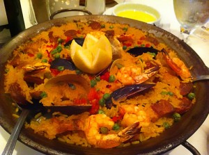
This experience reminded me that the liquor stores are not the only way to find good beer. A good restaurant or pub will have unique drink selections that will go wonderfully with their cuisine. Xingu was a great warm up for the delicious paella for two. There’s also something nice about pairing drinks that are culturally relevant. (I know Brazil is South American and we were having Spanish/Mediterranean but you get the idea.) There’s a whole world of beer to explore, possibly right in your backyard, you just have to get out and find it. Please share with us any “finds” you might have experienced in the comments below, we’d love to hear from you. Salud!

– Ben

paella for Costa Del Sol

Tags: , , ,

Bottle Cap Blues

Drinking, How To on June 4th, 2012 No Comments


I came across this video on Blog About Beer. The video was created by Adam Young and Chris Sumers. I’ve always prided myself on being able to open a beer bottle without an opener, just a good hard edge of any kind (except for teeth). This video takes bottle opening to a whole new level.


– Ben

Founders’ Pale Ale – Founders Brewing Company

Beer Label Reviews on June 4th, 2012 No Comments

beer label

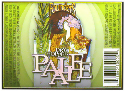
This label has caught my eye many times because of it’s use of a painting by Alphonse Mucha. I’m not going to pretend I am well versed in Alphonse Mucha’s work, but I did recognize this artwork because of a royalty-free Art Nouveau collection I used to design with back in the day. This painting was originally used for a play called Gismonda in 1894.  Since Mucha has long past his work can be used without copyright issues. Now a couple of things strike me as odd about this label, for example the large branch that the women is holding. It’s not barley, as one would expect on a beer label, it’s actually a palm leaf. I think the designer just really liked the ideas of using an Art Nouveau painting for a design. It’s an American brewery so the French reference is lost and the content doesn’t really align with what the beer is. The typography is fun, however I feel like it’s not quite finished. More time could have went into cleaning up the letterforms instead of just letting the serifs stick out and overlap all willy nilly. That’s just my humble opinion.  Hey, it’s a pretty label, it has nice color and from what I hear it’s a great beer. I look forward to trying one someday.
Tags:

Smuttynose “Finestkind” IPA – Smuttynose Brewery

Beer Label Reviews on May 29th, 2012 No Comments

finestkind

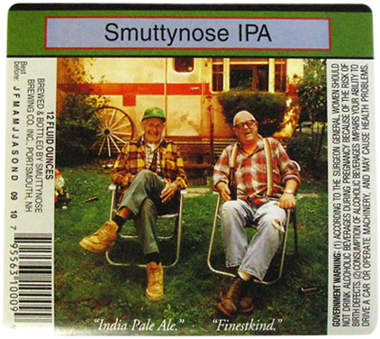
A picture is worth a thousand words and this one speaks to me.  Okay, the typography in this label is nothing to write home about, but this label has a strong concept. No pretension in this beer, how could it? These two old timers tell you straight up what you are about to enjoy. “India Pale Ale.” “Finestkind.”  You can almost hear them saying it. Rainbow suspenders, a garden gnome and a couple of big smiles tells the viewer that this beer is just plain fun. Lot’s of beers like to put the word “drinkability” on their labels, I think by the looks of the scattered empties on the ground that this photo speaks for itself.

Tags:

Prima Pils – Victory Brewing Company

Beer Label Reviews on May 21st, 2012 No Comments

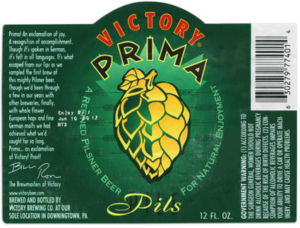
The vibrant green of this label works beautifully with the bold yellow hop graphic. “Victory for your Taste!” appears on the neck label (not shown here) and the small print on the side of this label gives you a bit of insight as to what the brewers intentions where. It explains that “Prima” is an exclamation of joy in German. They proudly explain that this beer was a journey for them and that through their experiences in brewing they where finally able to arrive at the Pilsner they were looking for. The brewmasters signatures add to this personal story.

Fun typography with the sharp edges of the “PRIMA” font balance with the scripty “Pils” type, which if you look closely, has a black condensed “PILS” font sitting just behind it. Mixing typefaces can often spell disaster for a design unless it is created by an experienced designer. This design has a lot of nice little details, like the barley that creates a line pattern behind the hop or the impactful color pallet that was chosen. Overall I’d say this label is a Victory for design as well as taste.


Checkerboard Label

Custom Labels, The Studio Pub, Wine Labels on May 17th, 2012 No Comments

Checkerboard Label

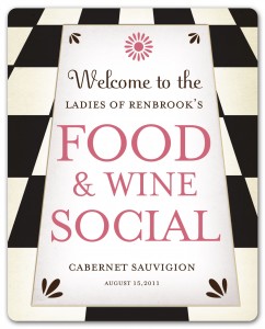
It’s tea time in Wonderland and Alice wants something a bit more potent. If the Cheshire cat had a wine cellar the labels would look like this. There’s something about a distorted checkerboard that is both mystical and slightly deviant. We created a label will add a touch of whimsy to your next stylish affair, ladies soiree, or social gathering made better with a great glass of wine. You’ll be the toast of the town when you send your guests home with a bottle adorned with this fully customizable label.

Good Design. Good Spirits.

Ben's Journal, Custom Labels on May 14th, 2012 No Comments

When I look at a bottle of beer that has a thoughtfully created label I am intrigued. I pop the top and pour its contents in a glass. I smell the aromas and hold it up to the light to reveal it’s color and clarity. I want to know more so I take a taste. Ah, the satisfaction of realizing you have chosen wisely. Again I look at the label; I want it to tell me more. What is this beer? What were the brewers’ intentions? A quality drink paired with a well designed label creates an experience that is greater than the sum of it’s parts.

Good design, good beer. This combination elevates a bottle of beer to a different level in one’s psyche, but it doesn’t end there. The next time I see that label in a store shelf, in a friends fridge or in the cooler at a picnic, I will have expectations. If those expectations are met again and again then the brew becomes something special. A great design on a bottle of wine or beer is nice, but by itself a label is only paper thin. On the same note, a good drink can be lost in a sea of glasses without its mark of quality. A marriage of good design and good spirits however, that my friend is greatness.

It is with these thoughts in mind that I decided to create The Studio Pub. Graphic design has been the focus of my career for many years now. Homebrewing has been my hobby of choice. In an effort to bring two things I truly love together, I decided to pursue good design and good spirits with The Studio Pub.  I want to make labels that have character and a story to tell. The stories, however are not my own- I’m merely providing tools for others to create labels that tell their story. That’s what good graphic design does. So whether you make your own libations or are choosing to label a commercial brew worthy of your life’s events, I hope your will join in the pursuit of that little something extra that happens when good design meet good spirits. Sláinte.

– Ben Quinn

Hazed & Infused – Boulder Beer Company

Beer Label Reviews on May 1st, 2012 No Comments

beer labelThis label always catches my eye in the shelves. It has a great color palette and the name is one of the better “hop” puns I seen. Not sure if they were inspired by the Led Zeppelin song or the movie Dazed and Confused. Either way I dig the hippy attitude and the vibrant colors. You know by looking at this label that it has been dry hopped and it is an ale, that’s about it though. Is it an IPA? Pale Ale? Eh, whatever man, it’s all good.

Tags: , ,